The Mark
 On Light
 On Brand
On Dark
On Brand
On Dark
Clear Space Rule
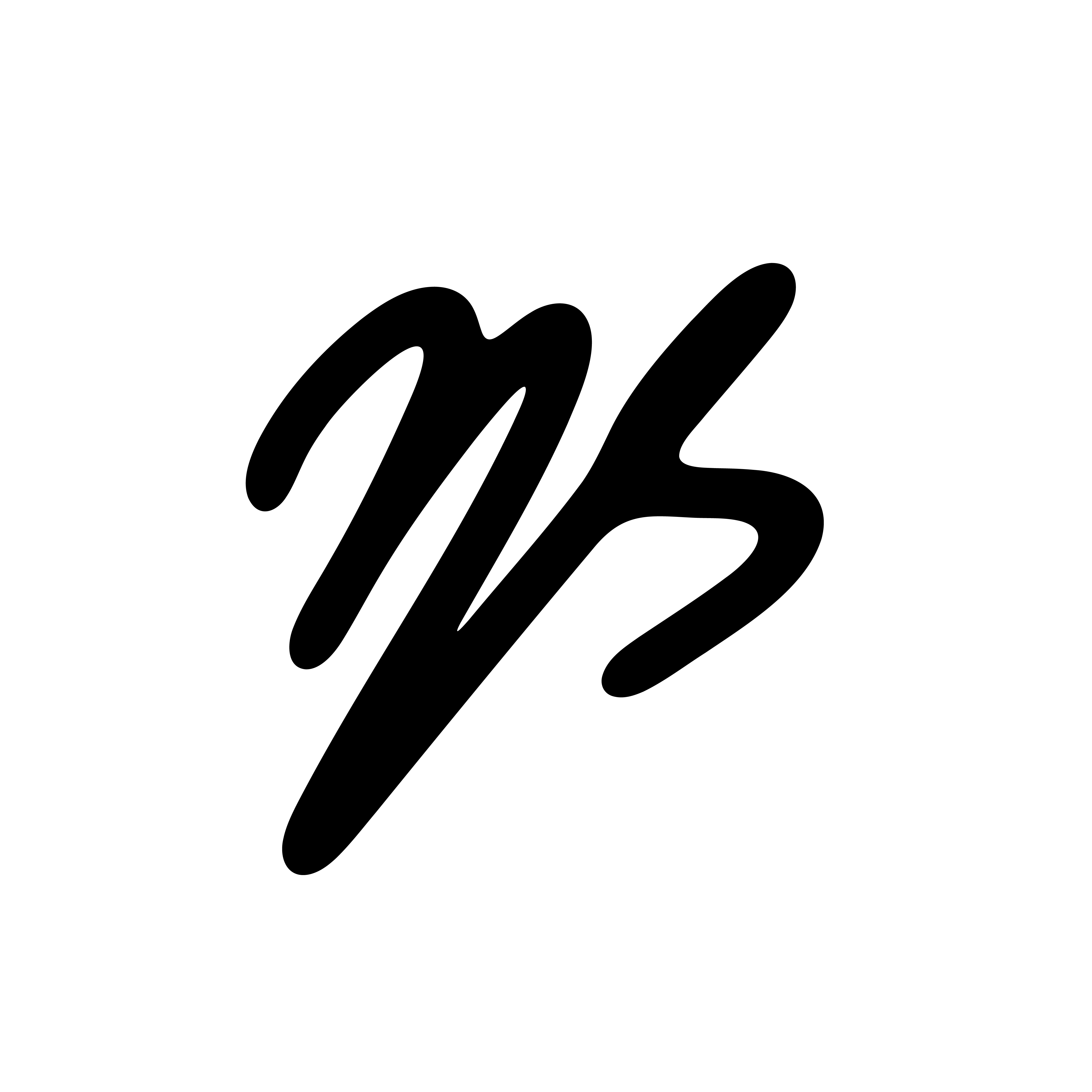
Maintain a minimum clear zone equal to the cap-height of the "N" letter on all four sides of the mark. Never crowd, rotate, recolour, or distort the logo. On photographic or complex backgrounds, always place the mark inside a solid dark or white container first.
Brand Colours
Type System
What I Designed
Visual identity — not a full content retainerI built the complete visual system for @ns.maths_ — logo, colour palette, typography, and a set of branded artboards to define how the brand looks on Instagram. The goal was a dark, precise aesthetic that signals academic authority while staying approachable for Bac students scrolling late at night.
The Thinking Behind the Work
I chose JetBrains Mono as the primary face because it reads like code and equations — the brand's native language. Every margin, every spacing unit is intentional. Nothing decorative that doesn't earn its place in the system.
Mono type → Equations, not decorationI went deep dark (#070D24) with electric blue accents deliberately — students study late, screens are bright. The palette reduces visual fatigue while signalling a modern, tech-adjacent brand that doesn't look like a school textbook.
Deep dark + blue → Focus-first designThe brief was a personal tutor with 40K+ followers and institutional reach. I built an identity that carries both — a personal mark (name-based logo, Arabic type) that scales to multi-platform without losing warmth or becoming corporate.
Personal name → Academic authority